


A school’s website is often the very first impression families get before they ever step onto campus. In fact, for many parents, your website is the deciding factor in whether they’ll schedule a tour or move on to another school.
But here’s the tricky part: sometimes the things that turn families away aren’t obvious to the school itself. You might look at your site every day and not notice the issues that quietly send prospective parents searching elsewhere.
Let’s walk through the seven most common website problems that can hurt enrollment, along with how you can spot before they leave a poor impression on families.
Outdated Information
One of the fastest ways to lose credibility with families is having old or inaccurate information on your site. Outdated tuition rates, last year’s open house details, or a faculty directory with staff who have moved on can all raise red flags.
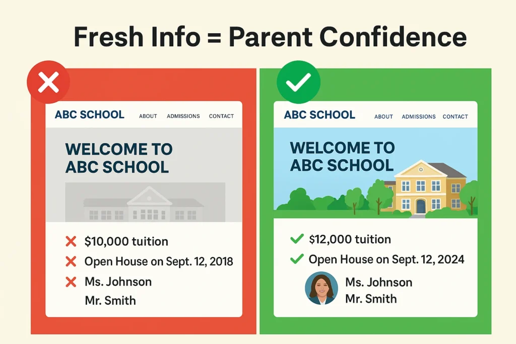
Parents want trust. They need to know your school is organized, current, reliable. When your website doesn’t reflect that, it creates doubt, and doubt can derail an enrollment decision.
Pro tip: Assign someone on your team to check key areas monthly: calendar, tuition, admissions deadlines, and staff pages. Fresh, accurate information builds trust, and regular website maintenance ensures prospective parents and students always see the most current details.
Slow Loading Time
Picture this: A parent has ten minutes between errands to look into schools. They click your website, and the homepage takes more than a few seconds to load. By second five, their patience is already wearing thin. By second eight, they’ve closed the tab.
Sounds dramatic? Maybe. But it’s true. Speed matters that much. Parents are accustomed to fast-loading apps, mobile banking, and streaming services. If your website lags, it sends an unspoken message: this school isn’t keeping up either.
Pro tip: Test your website’s speed on your phone, not just your computer. If it feels sluggish to you, it definitely feels sluggish to families. The fix often involves website optimization and SEO work, things like compressing images, cleaning up code, and improving server response time.
Broken Links & Errors
Imagine a parent is ready to take the next step. They click “Schedule a Tour” or “Apply Now,” only to land on an error page. Chances are, they won’t try again.
Even a small broken link can create a major roadblock in your enrollment funnel. Parents don’t want to dig around; they want a smooth path forward.
Pro tip: Put yourself in a prospective parent’s shoes and walk through your site monthly. Click on every important link, especially “Apply,” “Contact Us,” and “Visit.” You might be surprised at what isn’t working the way you thought.
Not Mobile-Friendly
Most parents will visit your school’s website from their phone, not a desktop computer. If your site is difficult to navigate on a small screen, with tiny text, menus that don’t expand properly, or images that don’t resize, you’ll likely lose them.
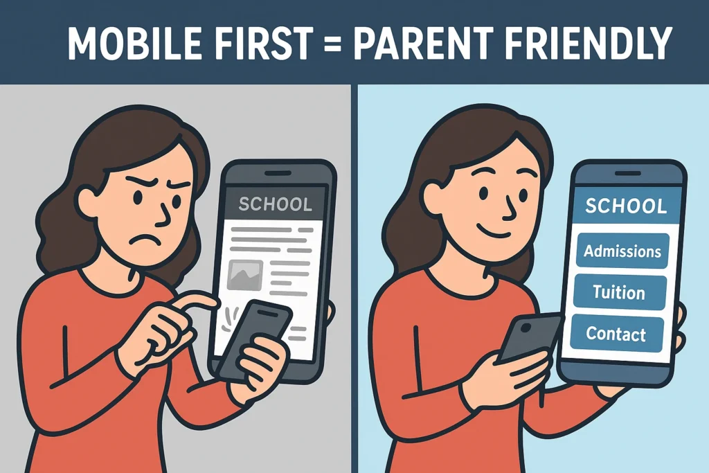
A mobile-friendly site isn’t just about looks. It’s about ensuring parents can get the information they need quickly and easily, whether they’re at work, in the carpool line, or sitting at a coffee shop.
Pro tip: Pull up your website on your phone. Can you easily find tuition information, admissions details, and contact information in less than 30 seconds? If not, families may be having the same problem.
Lack of Social Proof and Community Feel
Parents want to see evidence that your school delivers on its promises. Without testimonials, photos of engaged students, or glimpses into daily school life, your website feels sterile and untrustworthy.
Today’s families research schools like they research major purchases: they want to see reviews, hear from other parents, and get a sense of the community they’re potentially joining. A website filled only with mission statements and curriculum details misses this crucial emotional connection.
Pro tip: Add a rotating testimonial section on your homepage, showcase recent student achievements, and include authentic photos of school life. Consider adding a “Day in the Life” video or virtual tour to give families an inside look.
Missing or Buried Key Information
Nothing frustrates prospective parents more than hunting for basic information. If tuition rates, grade levels served, or application deadlines are buried three clicks deep, you’re creating unnecessary friction in the inquiry process.
The information parents need most should be the easiest to find. This includes tuition and fees, academic programs by grade level, admissions requirements and deadlines, contact information, and school calendar highlights.
Missing Clear Calls-to-Action
Your website should guide parents through a journey. But too often, schools leave families with nowhere to go. Maybe your homepage is beautiful and informative, but without a clear “Apply Now” or “Schedule a Tour” button, you’re asking parents to figure it out themselves.
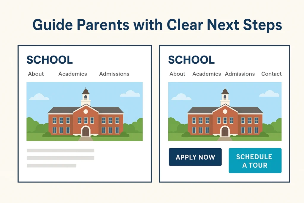
Parents don’t want to guess at the next step; they want it laid out for them. Without clear calls-to-action (CTAs), you risk losing families right at the moment they’re ready to connect.
Pro tip: On every major page of your website, include one clear next step: Inquire, Apply, or Visit. Don’t be afraid to make these buttons bold and easy to find.
Why This Matters?
Each of these issues—slow load times, outdated information, broken links, poor mobile design, and missing CTAs—seems small on its own. But together, they shape parents’ impressions of your school before you ever get the chance to welcome them in person.
The good news is that every one of these problems is fixable. Fixing them doesn’t just improve your website; it also strengthens trust, builds confidence, and makes families more likely to take the next step toward enrollment.
If you’d like help fixing your website and strengthening your digital presence, we offer services tailored to schools like yours.
In Conclusion
Think of your website as your school’s digital front door. Families form opinions quickly, and even small frustrations can make them turn away.
Take time this month to conduct a comprehensive “parent test” of your site:
- Open it on your phone and tablet
- Pretend you’re visiting for the first time
- Try to find admissions information, tuition, and how to schedule a visit
- Look for social proof and community indicators
- Test all major buttons and forms
- Time how long it takes to complete key actions
If anything feels slow, outdated, or confusing, it’s worth addressing. Consider surveying recent inquiring families about their website experience, their feedback can reveal blind spots you might miss. Your website doesn’t need to be flashy, but it does need to be functional, accurate, and welcoming.
By keeping your site user-friendly and up to date, you make it easier for families to focus on what really matters: discovering how your school can be the right fit for their child.
Want to make sure your website is working as hard as it can to support enrollment?